Announcement
Collapse
No announcement yet.
New plasma desktop
Collapse
This topic is closed.
X
X
-
New plasma desktop
Linux since 2008, Kubuntu 20.10
*ASUS 970 PRO GAMING/AURA AM3+ AMD 970 + SB 950 SATA 6Gb/s USB 3.1
*AMD FX-8370 with AMD Wraith cooler Vishera 8-Core 4.0 GHz (4.3 GHz Turbo)
*G.SKILL Ripjaws X Series 16GB DDR3 SDRAM -- Asus GEFORCE GTX 1050 TI 4 GBTags: None
- Top
- Bottom
-
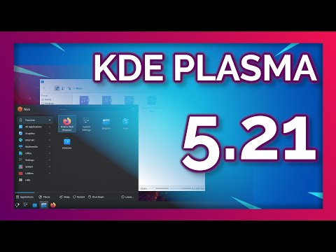
So do I, but more importantly, I really hate this going back and forth on non-functional style decisions like that. (A few KDE/Plasma iterations ago, we already had non-contrasting title bars in the default theme, of course.)Originally posted by rdonnelly View PostI kind of like the contrasting border at the top that we have now.
So why is such back and forth bad? Because it makes training and user support a nightmare.
Casual users (to say nothing of novices) simply don?t know if and when such color changes convey system state. So when all of a sudden title bars no longer stand out, ?all the windows are disabled.?
Of course, configurability is great ? that?s why we love KDE ? but such changes belong in optional themes and color schemes, NOT in the default look and feel.
- Top
- Bottom


Comment