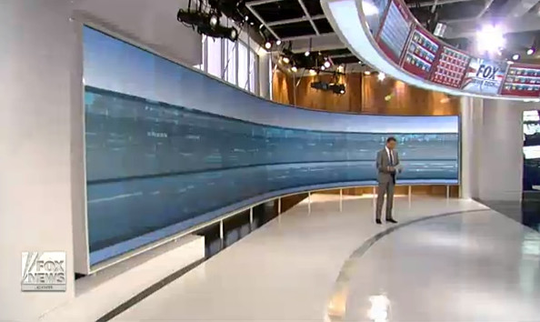
Another take three pictures and two analyses:
I think that anyone would probably think that this "news deck" is AT LEAST....SOMEwhat kewl! FORGET WHAT NETWORK IT IS look at the pics and then read the analyses.

That is NOT virtualized, it is hundreds of screens, reasoning behind it to follow.

Now......here is an analysis from 'the Verge:
http://www.theverge.com/2013/10/7/48...mith-news-deck
Here is what the CEO of ClickSpring(the hardware and set designer) said along with Shephard Smith:
This set ............. it’s about the news.
It’s a design that truly does put the news first.
While the set to many may seem flashy, this is really not a flashy set.
Ulfers described it as having a fairly neutral palate and being a “fairly significant break for Fox News” set design.
It just has a lot of moving news.
“The data is more important than the branding of the show, Shepard Smith or Fox News,” said Ulfers.
The graphics are tame, the set treatments are neutral, the monitor walls are plenty… but they just have the stories.
A newsroom on camera is not a new idea, but ...............camera and off camera technology to create something more than just an office space with studio lighting.
http://www.newscaststudio.com/2013/1...s-deck-design/
Ok so here is what THE SAME COMPANIES DID FOR CNN:

So the question which I would like to pose is..... there are two different approaches shown above....
Visually, at least it HAS to be a MATTER OF TASTE.
But....... why is it that a "lefty" group like the Verge has to be so HATEful of ......Fox News...
ABOUT THE SET!!?
Normally they just hate on FoxNews in general....but..THE SET!? :0
Search around to see if you can find hateful posts about CNN's set?
Remember, both made by the same people.
So.....maybe when ....people who "say" that "we" are "Commies", they have in the backs of their minds..... this kind of stuff being continually produced by "the left" / "the mainstream media" / ummm no talk radio because even with govt. subsidies the only lefty talk radio is gone, ...
maybe those people don't like the kind of stuff that is shoveled out continually about a news organization that..."we" DESPISE.....
maybe it really is a matter of "perception" on BOTH sides...
woodsmoke
I think that anyone would probably think that this "news deck" is AT LEAST....SOMEwhat kewl! FORGET WHAT NETWORK IT IS look at the pics and then read the analyses.

That is NOT virtualized, it is hundreds of screens, reasoning behind it to follow.

Now......here is an analysis from 'the Verge:
Fox News has just unveiled a breathtakingly ridiculous newsroom,
complete with novelty-sized Windows-based touchscreens,
a Twitter wall, and
a wannabe Minority Report-style display, which it hopes will connect it with generations of viewers who use smartphones and apps.
complete with novelty-sized Windows-based touchscreens,
a Twitter wall, and
a wannabe Minority Report-style display, which it hopes will connect it with generations of viewers who use smartphones and apps.
Here is what the CEO of ClickSpring(the hardware and set designer) said along with Shephard Smith:
From Ulfers(ClickSpring)
MSNBC has a newsroom background (sometimes), so does CBS News and ABC News.
Those are just people mulling about at desks,
what Clickspring has done with Fox News takes it a step further,
placing the anchor into the realtime “activity feed” of news as it enters the producers screens.
“It’s a work environment,” said Ulfers. “It’s 100 percent authentic in terms of their workspace. It’s not fake or just for the broadcast, that’s whats kinda new about in a way.”
It’s a design that truly does put the news first.
While the set to many may seem flashy, this is really not a flashy set.
Ulfers described it as having a fairly neutral palate and being a “fairly significant break for Fox News” set design.
It just has a lot of moving news.
“The data is more important than the branding of the show, Shepard Smith or Fox News,” said Ulfers.
The graphics are tame, the set treatments are neutral, the monitor walls are plenty… but they just have the stories.
A newsroom on camera is not a new idea, but ...............camera and off camera technology to create something more than just an office space with studio lighting.
Ok so here is what THE SAME COMPANIES DID FOR CNN:

So the question which I would like to pose is..... there are two different approaches shown above....
Visually, at least it HAS to be a MATTER OF TASTE.
But....... why is it that a "lefty" group like the Verge has to be so HATEful of ......Fox News...
ABOUT THE SET!!?
Normally they just hate on FoxNews in general....but..THE SET!? :0
Search around to see if you can find hateful posts about CNN's set?
Remember, both made by the same people.
So.....maybe when ....people who "say" that "we" are "Commies", they have in the backs of their minds..... this kind of stuff being continually produced by "the left" / "the mainstream media" / ummm no talk radio because even with govt. subsidies the only lefty talk radio is gone, ...
maybe those people don't like the kind of stuff that is shoveled out continually about a news organization that..."we" DESPISE.....
maybe it really is a matter of "perception" on BOTH sides...
woodsmoke


Comment