I've used a backup/file copy utility named FreeFileSync, which I recommend. However, with the latest version, I've encountered a mystery with its interface. I don't feel like I desperately need to change it, but I would like to understand it. Up through version 11.5, I always manually installed it. I would just download its archive file and extract it to the hard drive in a directory named "manualinstalls", then put its icon manually into Kubuntu's "edit applications" thing. Once it was in there, I would also send its icon to the panel for easy quick access, since I use it all the time. Here's how version 11.5 looks on my Dell desktop PC:
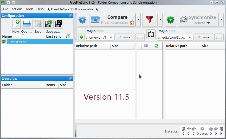
If I'm not mistaken, that's the regular KDE interface for an app, right?
So then I decided to upgrade to the latest version, version 11.9. Looks like they've changed their archived file to include some kind of installer. No biggie, but I couldn't get it to work. Instead of troubleshooting that installer, I elected to install version 11.9 via Flatpak, a system I've had good luck with when installing other applications. The install went fine, but the interface now looks different:
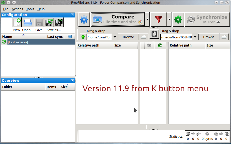
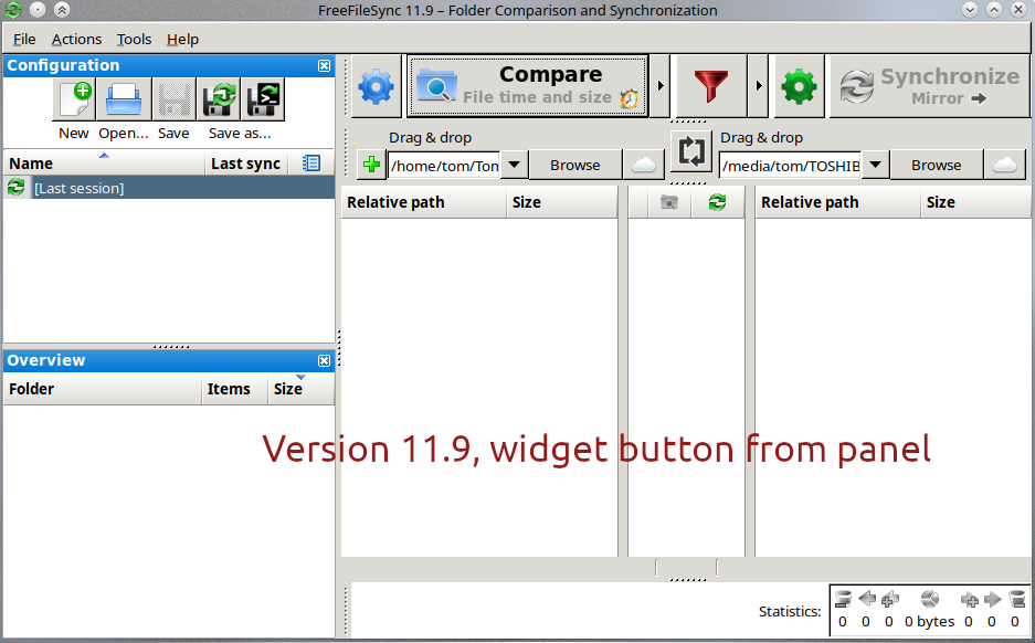
As you can see, the buttons are now more boxy, more like an old-style Windows 2000 install. This screen shot is from choosing it via the K/start button and choosing the app. If I choose it from the panel widget, it's the same:
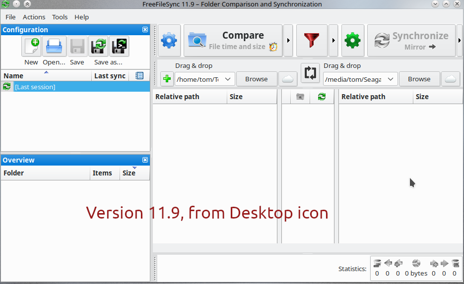
Now, here's the strange thing. If I run FreeFileSync from the desktop icon, it's back to the interface that we saw in version 11.5:
Of course, this isn't a disaster or anything. I won't die if I run it one way and get the more boxy interface, and it runs fine either way. Plus, if I really preferred the more flat and slightly more modern interface, I could always just run it from the desktop icon.
My main purpose of posting this is to understand why. Why does FreeFileSync's interface change depending on how I run it? Also, am I correct that the more flat-looking interface is the KDE one while the more boxy one is GTK? Or is the difference from something else?
In System Settings ==> Application Style, I've chosen "Breeze." In System Settings ==> Window Decorations, I've chosen air-oxygen, which I believe is a downloaded one if I remember right. It's a version of Oxygen that includes the "always keep above" choice built-in. Picked that one after I did my install.
Like I say, the boxy interface isn't any kind of deal breaker. I'm just seeking to understand what's going on. If anyone knows, I would be glad to hear from you. Thanks.

If I'm not mistaken, that's the regular KDE interface for an app, right?
So then I decided to upgrade to the latest version, version 11.9. Looks like they've changed their archived file to include some kind of installer. No biggie, but I couldn't get it to work. Instead of troubleshooting that installer, I elected to install version 11.9 via Flatpak, a system I've had good luck with when installing other applications. The install went fine, but the interface now looks different:

As you can see, the buttons are now more boxy, more like an old-style Windows 2000 install. This screen shot is from choosing it via the K/start button and choosing the app. If I choose it from the panel widget, it's the same:

Now, here's the strange thing. If I run FreeFileSync from the desktop icon, it's back to the interface that we saw in version 11.5:
Of course, this isn't a disaster or anything. I won't die if I run it one way and get the more boxy interface, and it runs fine either way. Plus, if I really preferred the more flat and slightly more modern interface, I could always just run it from the desktop icon.
My main purpose of posting this is to understand why. Why does FreeFileSync's interface change depending on how I run it? Also, am I correct that the more flat-looking interface is the KDE one while the more boxy one is GTK? Or is the difference from something else?
In System Settings ==> Application Style, I've chosen "Breeze." In System Settings ==> Window Decorations, I've chosen air-oxygen, which I believe is a downloaded one if I remember right. It's a version of Oxygen that includes the "always keep above" choice built-in. Picked that one after I did my install.
Like I say, the boxy interface isn't any kind of deal breaker. I'm just seeking to understand what's going on. If anyone knows, I would be glad to hear from you. Thanks.


Comment