Announcement

Collapse
No announcement yet.

Please test and give feedback on a switch to Breeze Dark Plasma theme by default

Collapse
This topic is closed.
X
X
 
  • Filter
  • Time
  • Show
Clear All
new posts

    Please test and give feedback on a switch to Breeze Dark Plasma theme by default

    See: https://kubuntu.org/news/testing-a-s...me-by-default/

    Today’s daily ISO for Bionic Beaver 18.04 sees an experimental switch to the Breeze-Dark Plasma theme by default.

    Users running 18.04 development version who have not deliberately opted to use Breeze/Breeze-Light in their systemsettings will also see the change after upgrading packages.

    Users can easily revert back to the Breeze/Breeze-Light Plasma themes by changing this in systemsettings.
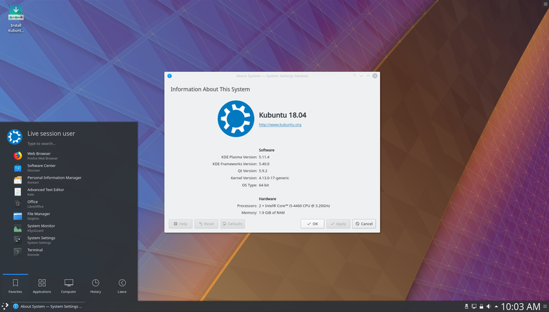


    Feedback on this change will be very welcome:

    You can reach us on the Kubuntu IRC channel or Telegram group, on our user mailing list, or post feedback on the (unofficial) Kubuntu web forums

    Thank you to Michael Tunnell from TuxDigital.com for kindly suggesting this change.

    Last edited by acheron; Dec 10, 2017, 12:04 PM.
    On #kubuntu-devel & #kubuntu on libera.chat - IRC Nick: RikMills - Launchpad ID: click

    #2
    As long as this stands true; "Users can easily revert back to the Breeze/Breeze-Light Plasma themes by changing this in systemsettings.", I can see no reason to complain.

    Personally, I prefer a medium intensity transparent Desktop theme (currently using "Diamond" with "Arc" window decorations) and then I often switch my wallpaper.

    The one thing I would like to see returned is the ability to edit the window decorations - at least the button position - within System Settings.

    Please Read Me

    Comment


      #3
      That looks like what i have already which is look and feel set to breeze and then desktop theme set to breeze dark. So yeah I'd be fine with that

      Comment


        #4
        looks good to me ,,,,,I use the breeze dark colors and a dark desktop theme with transparency ,,,so no prob @hear

        VINNY
        i7 4core HT 8MB L3 2.9GHz
        16GB RAM
        Nvidia GTX 860M 4GB RAM 1152 cuda cores

        Comment


          #5
          I've been using Breeze Dark for quite awhile now, and the only problem I've had with it was the inability to read some buttons on Libre Office Writer. Whether a dark theme would be preferred by more potential users than a lighter theme is another story.

          Comment


            #6
            Originally posted by oldgeek View Post
            I've been using Breeze Dark for quite awhile now, and the only problem I've had with it was the inability to read some buttons on Libre Office Writer. Whether a dark theme would be preferred by more potential users than a lighter theme is another story.
            This change is to the Plasma theme only. Apps would still use light Breeze, so those issues should not occur.
            On #kubuntu-devel & #kubuntu on libera.chat - IRC Nick: RikMills - Launchpad ID: click

            Comment


              #7
              Then the change seems rather irrelevant. The idea is that a KDE desktop can be user-designed, so why worry whether the default theme is dark or light, if the user has the freedom to change it anyway.

              Comment


                #8
                Originally posted by oldgeek View Post
                Then the change seems rather irrelevant. The idea is that a KDE desktop can be user-designed, so why worry whether the default theme is dark or light, if the user has the freedom to change it anyway.
                That may be so, and I don't disagree.

                However, 1st impressions count as the saying goes, so this is exploring a change to that default. Taking in mind both the choices of current users, and what perhaps new users might find better.
                On #kubuntu-devel & #kubuntu on libera.chat - IRC Nick: RikMills - Launchpad ID: click

                Comment


                  #9
                  As a first impression, to me, the light themes have always been a distraction from my artistic perception. I always immediately add in my dark themes I use. Again, that is me and I would suspect there are others that would counter my first impressions. You won't be able to satisfy everyone so if the options to change are still there, no harm no foul.

                  Comment


                    #10
                    it looks a bit strange - apps bright, theme dark. both dark or both bright. that makes more sense.

                    i use darker themes (usually) as they don't strain the eyes so much.

                    Comment


                      #11
                      Originally posted by MoonRise View Post
                      ... You won't be able to satisfy everyone so if the options to change are still there, no harm no foul.
                      +1
                      Originally posted by mastablasta View Post
                      it looks a bit strange - apps bright, theme dark. both dark or both bright. that makes more sense.
                      ...
                      I agree. The initial appearance should be both dark or both light. I don't get the logic of the example image in the first post.
                      Kubuntu 20.04

                      Comment


                        #12
                        Originally posted by chimak111 View Post
                        +1

                        I agree. The initial appearance should be both dark or both light. I don't get the logic of the example image in the first post.
                        Well, I use the combo already and my reasoning is that I like the contrast of the dark and light. Perhaps I find it easier to focus on the areas I most look at when they are bright and separate from the panels and title bars. I haven't really thought about it.

                        Comment


                          #13
                          Originally posted by mastablasta View Post
                          i use darker themes (usually) as they don't strain the eyes so much.
                          I've bleated about this for years. The default dark theme for Bionic Beaver is promising.

                          BTW, the new firefox has the "Dark Background and Light Text" add-on which is working really well, surprisingly so. I feared the worst with my old darkness add-ons dying, but this has several approaches, which it remembers for each website.
                          Regards, John Little

                          Comment


                            #14
                            Just installed in a VM to get a look.

                            I gotta say I like. The dark theme looks good, and plasma 5.12 is smooth as butter.

                            At the risk of being banned, the beaver's looking slick

                            Comment


                              #15
                              Originally posted by jlittle View Post

                              BTW, the new firefox has the "Dark Background and Light Text" add-on which is working really well, surprisingly so. I feared the worst with my old darkness add-ons dying, but this has several approaches, which it remembers for each website.
                              OMG ,,,,I love this ,,,thank you for mentioning it .
                              I have semi light sensitive eyes ,,,hence my preference for dark themes ,,,,this is gold for me

                              VINNY
                              i7 4core HT 8MB L3 2.9GHz
                              16GB RAM
                              Nvidia GTX 860M 4GB RAM 1152 cuda cores

                              Comment

                              Working...
                              X